This project involved creating a branding for a family bar. I designed everything using only the client’s idea for a Maryland themed bar named “The Hive”. I chose to focus on seafood, especially crabs, because of Maryland’s famous blue crabs. I first researched his other bar location as well other seafood bars throughout the U.S.
I then started with the logo associating the word “hive” with bees. So I took that idea and tried to create a crab using hexagons, like that of a honeycomb. After many versions, I simplified it to diamond shapes creating a crab. I chose the serif font from my research into other family bars that also used serifs and thin fonts.
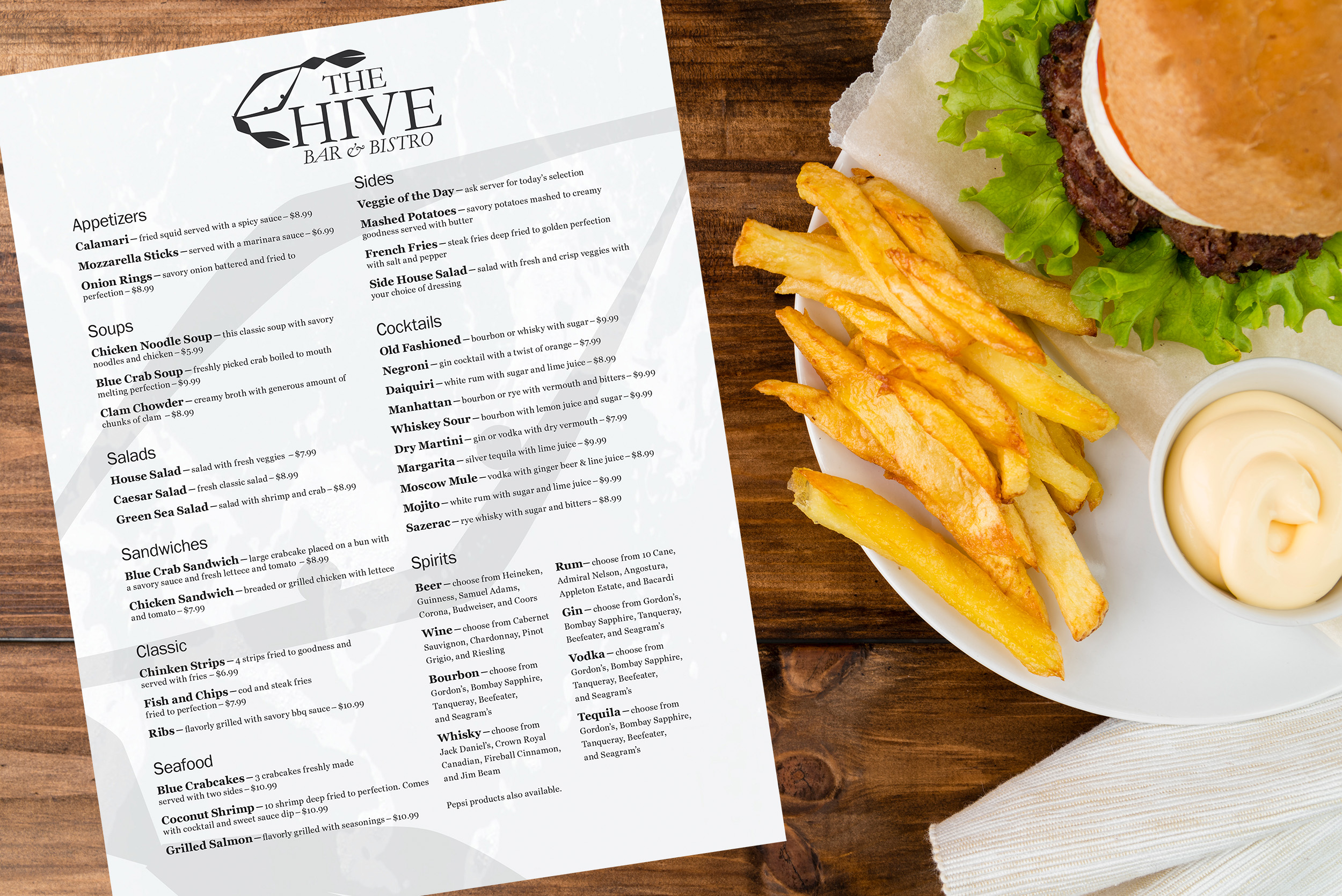
For the menu design itself, I started by making the menu have two columns to show the information in. I then figured out what fonts I wanted to use on it. I used typography hierarchy to make each section clear and concise. By using my research other seafood bars across the country, I filled the menu.
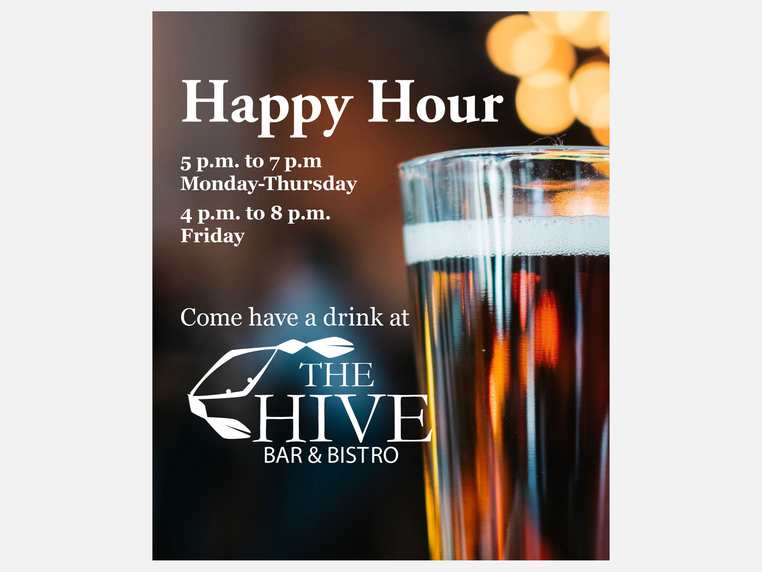
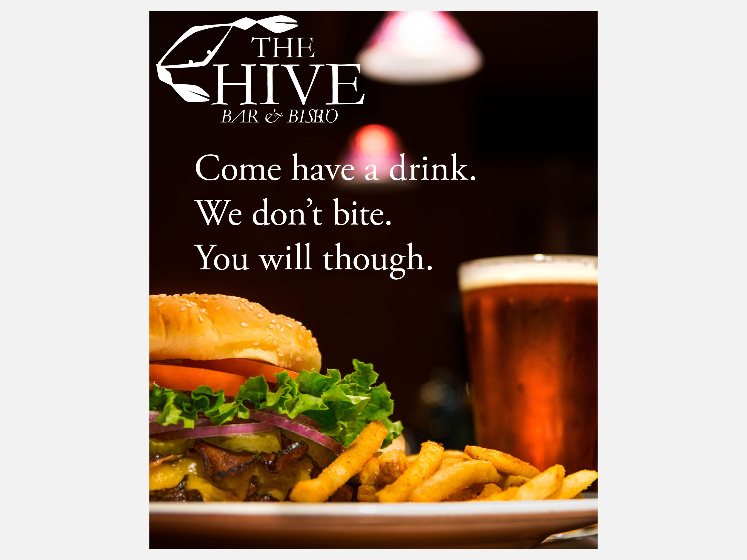
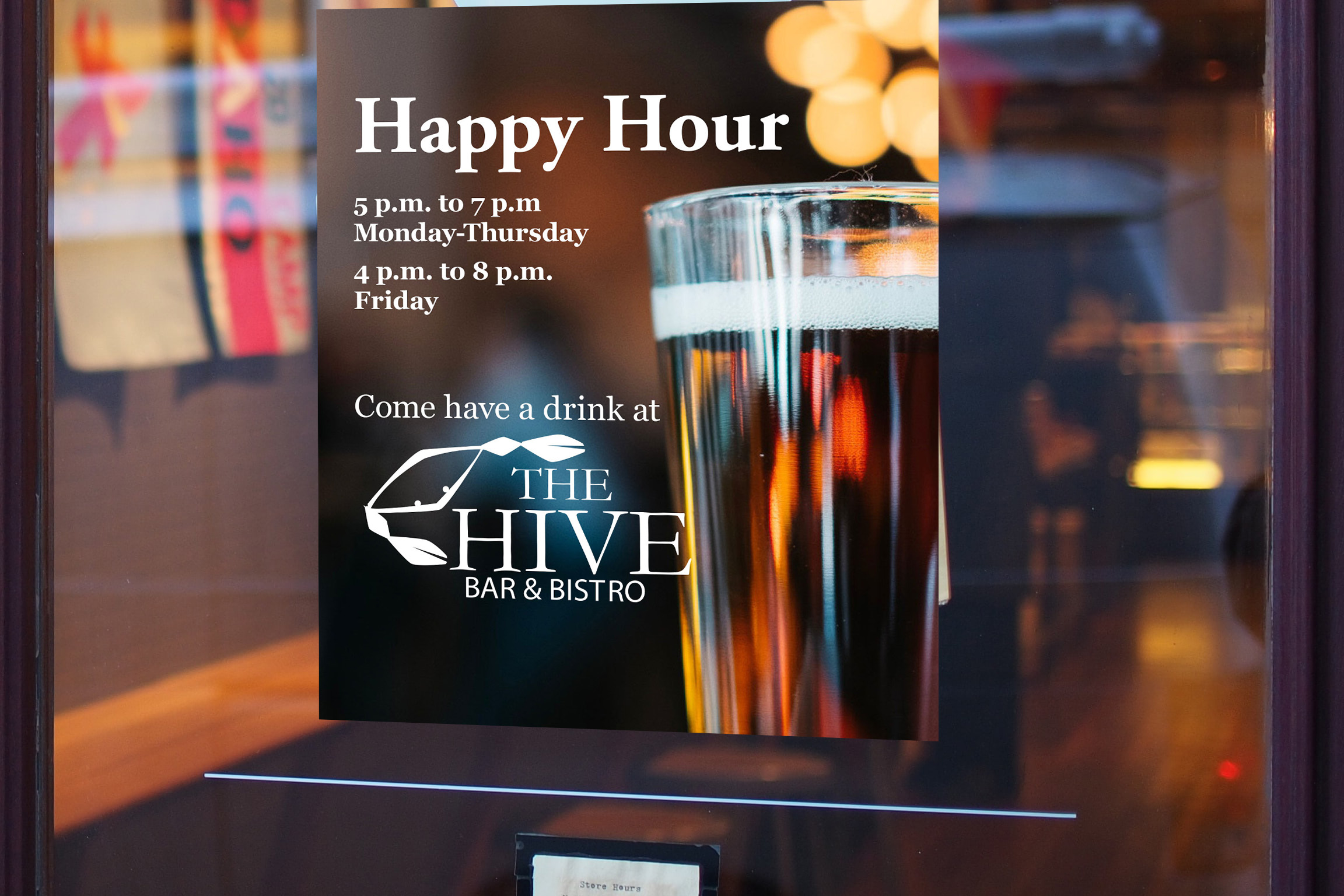
I also designed a set of signs to be used on windows and tables. One is an ad for meals and the other is for happy hour every weekday. I looked to real ads for restaurants in my designs with most of the page being an image with large type.