The idea of the spice label design was to create a fictional spice company then create branding for the company to use for the class project. I decided on using St. Augustine in Florida as my company’s location.
I researched the area and found a Spanish history and a famous lighthouse which I based the logo after. I decided to focus on seafood because of St. Augustine being famous for their seafood dishes.
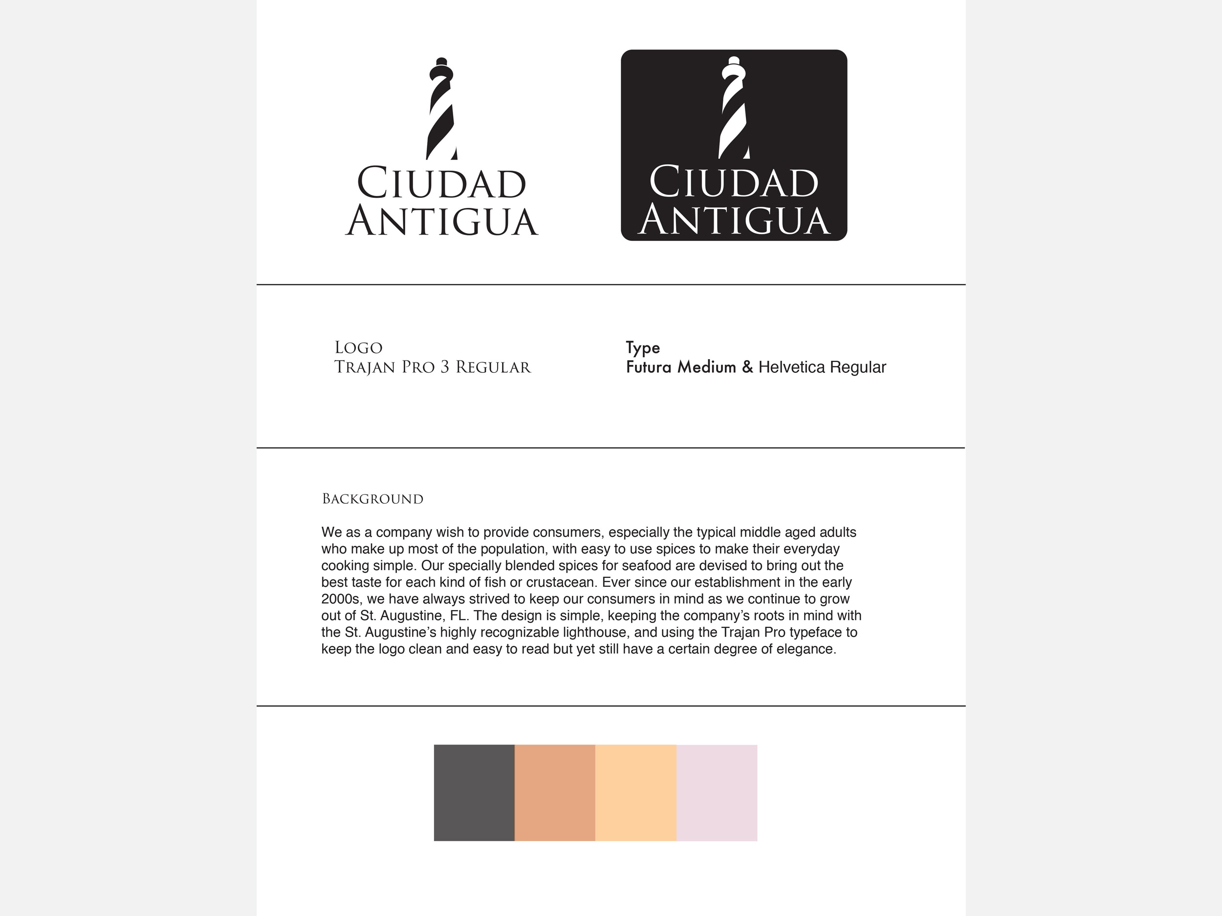
I started with the logo creating multiple versions but deciding on the lighthouse because I liked how the black and white space worked together to create the image.
I decided on the name Ciudad Antigua due to the heavy Spanish influence in the area. Another name for St. Augustine is Old City and so I translated that into Spanish. I wanted the image of the company to be less modern so I went with a serif font.
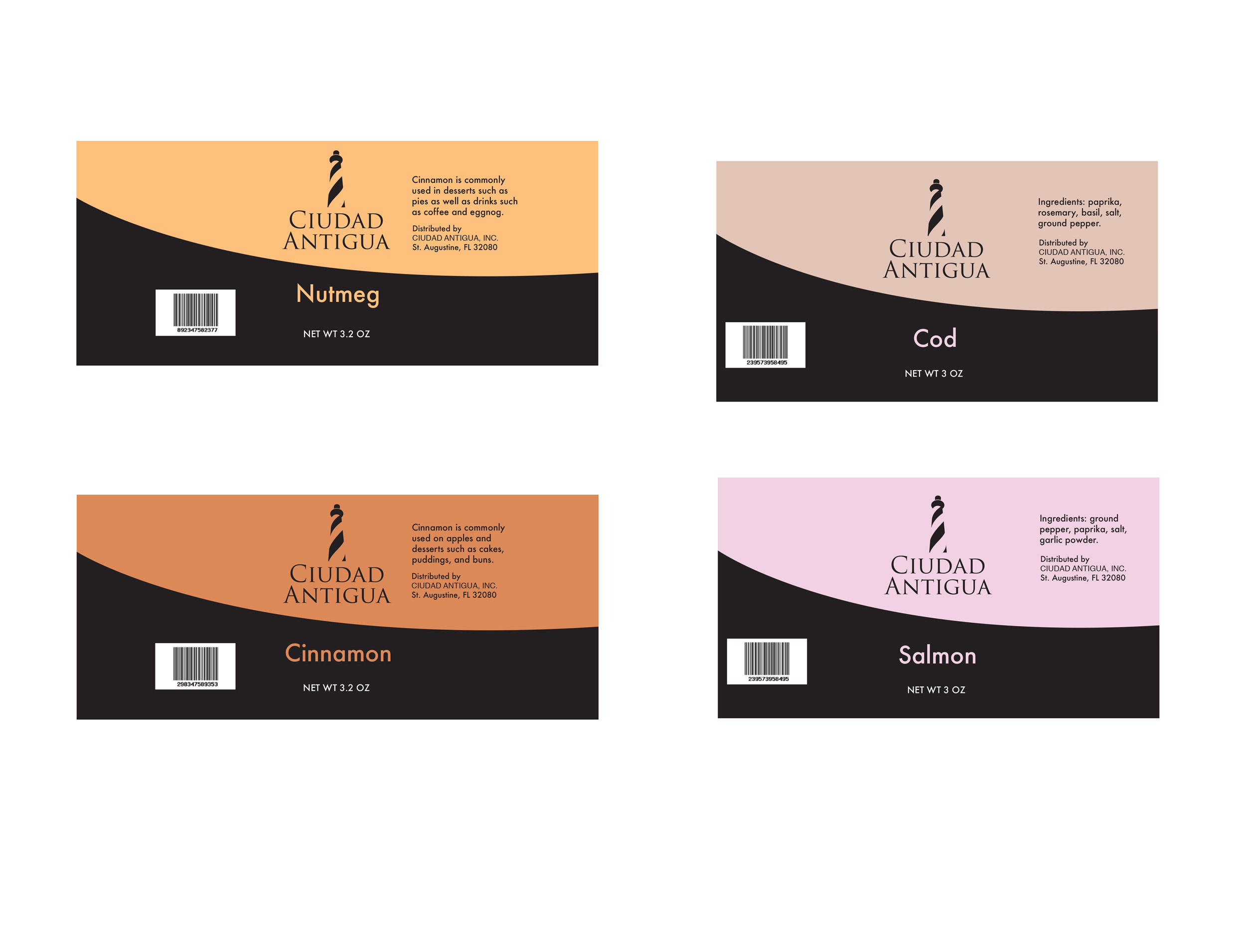
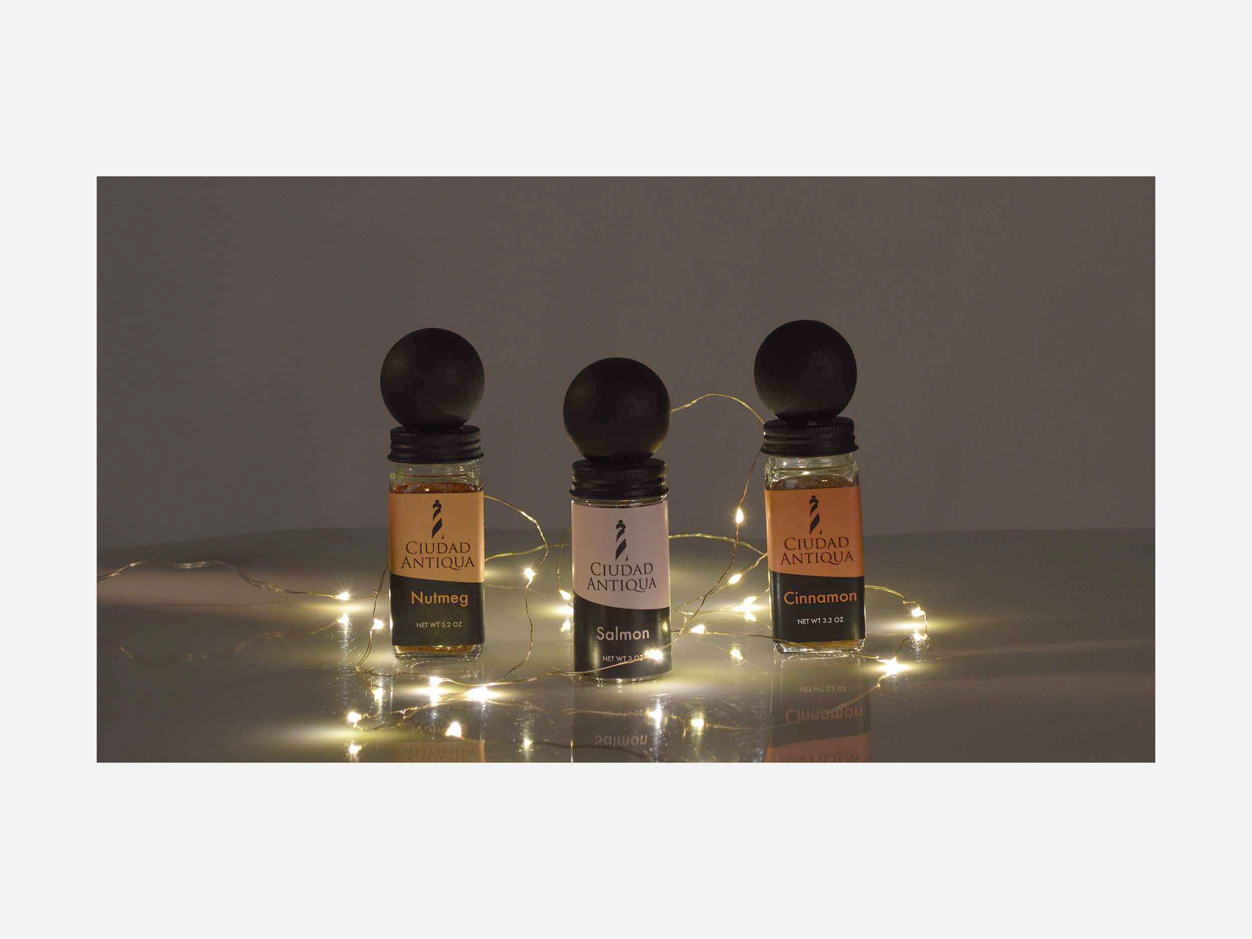
For the labels I sampled the color of the spice involved to decide the colors. I created two separate label sizes depending on if the spice mixture or just a single kind. Round became mixtures and regular spices were square. I added a black ball on top using a wooden knob to, in combination with the two colors, make the bottle resemble a lighthouse.